We also agreed that the 'word' poster on the reverse would be better using difefrent weights of one typeface so Beth and I agreed to develop this.
Sarah and Baljeet went through the content and planned what would go where in the PDF.
Beth sent a reminder to all the Interior Design students to send us more images ( Some had not sent any and some only one.)
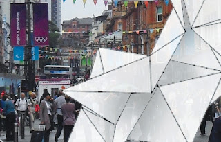
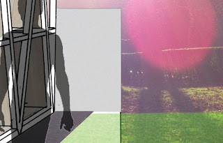
These are the thumbnails:
This is the development for the typographic poster using Gotham.


No comments:
Post a Comment