
Lisa Whitaker FMP
Showing posts with label OUGD303DP. Show all posts
Showing posts with label OUGD303DP. Show all posts
Tuesday, 28 May 2013

Summative Evaluation
Final Major
Project - Summative Evaluation
I was just starting to enjoy designing this last week… I think one
major learning point is that pressure really focuses me in terms of my
creativity. When a deadline is looming the design ideas seem to flow more. One
major benefit of doing so much research and concept developing earlier on – the
foundations were already there.
I still have a voracious appetite for research and being aware of new
trends and innovation. I have enjoyed extending my knowledge of Indesign,
Illustrator and Photoshop in order to deliver some of the designs digitally and
for print. I still haven’t made time to extend my understanding of web
development however I know how to set a URL up and also using platforms like
Cargo and Go daddy to produce a reasonable online presence.
I loved designing and making the Design Context case bound book however
I am disappointed with myself that I did not leave more time to proof read it
properly. I don’t think there are any
spelling mistakes but there are some double spaces and punctuation errors. The problem was it was so many pages I didn’t
want to print it out even in black and white as it cost me £33 to print the
colour version. However I think going forward it is the only way to proof read
a document thoroughly.
To focus the evaluation I am going to summarise each brief
Brief One allowed me to continue an exploration of Brands, young people
and culture, which fitted with the theme of my dissertation. This brief made me
ask a lot of questions about my own ethics and ultimately whether authenticity
really matters. The Hollister brand really annoys me with its fake back story
however I am happy that I made the outcome of the brief positive rather than
negative and in turn made something which is relevant in today’s `experience
economy. I really enjoyed designing the ‘Classic’ books concept and am pleased
with the concept I have proposed. (Both my son’s were impressed!)
Brief Two allowed me to research a Global Brand and also consider its
Sustainability strategy. It also
informed my Design context and I believe that there is a real push in the corporate
world to connect Design with Business Strategy more. I enjoyed developing a
Campaign within strict brand guidelines as the focus could be on the Concept
not the colours or typeface used. Going forward I do need to rein in the
research somewhat as I am aware there isn’t usually so much time in the real
world.
Brief three although I am pleased with the final outcome I am
disappointed I couldn’t have had more impact on the final design but sometimes
you just have to recognise someone else’s strengths. Also I found myself working at home a lot
more on this module as I saved a lot of time not commuting in. This meant I missed a few meetings so felt
slightly out of the loop even though the girls always kept me informed. The only feedback I would give is the design
for the Print version was done in Illustrator, which meant sharing the files
was difficult. I always design layouts
in Indesign and this experience has reinforced this.
Brief four was both enjoyable and frustrating. I really enjoyed understanding Tom’s practice
and also it was a pleasure to reconnect with the Arts and Crafts movement. The problem was Tom was sometimes a bit slow
to respond to actions and also did not have any photographs or portfolio. Nor he
did not have an up to date CV. The brief
also changed slightly halfway through from branding a new business to his
personal branding. Fortunately the identity design still worked for him
personally. The main frustration happened when I need to photograph the work
and he had not made the cards or the folder. I understand he has deadlines too so
perhaps I should have factored in a contingency plan. Fortunately he managed to
make them for the hand in deadline.
Brief five I learnt a lot about compromise with this brief mainly
because of the budget. From day one I had made the client aware how much the
booklets would cost and this shaped the format of the book to a large
degree. One triumph was persuading her
to spend another £25 for the cover lamination which was money well spent. I have made some great contacts with local
printers and also gained more knowledge about commercial printing particularly
the limitation of digital.
Overall I am happy with all the concepts I have developed however
slightly disappointed with the outcomes, especially the physical outcomes which
are a bit thin on the ground. Ultimately
I have tried to rationalise this, as my practice is not about handcrafting or
making packaging. I have also been quite
distracted applying for job and going for interviews, which ultimately has also
informed my practice. I think an In-house Graphic design role would suit me
even though I still aspire to work in a designs studio. The roles I have been
applying for are working across both print and digital media, which will feed
my appetite to keep learning new skills.
I feel confident I am on the right path to becoming a skilled, thoughtful,
commercial graphic designer.
Brief 3 - Interior Design Yearbook
This brief started as a significant brief but I replaced with the Alumni Competition brief. Although I contributed to the concept development, content collection and some of the design development for the poster my role in the final design and layout was minimal so I do not have finished outcomes to put on boards.
Brief 6 Design Context PDF
The final print version typeface is Adobe Caslon however I chose Adobe Garamond as this proved a more readable Serif typeface for online use.
Brief 8 Alumni Identity Module Submission
I am submitting this brief as my fifth significant brief as it demonstrates my concept development, design development and a design outcome.
Brief 9 Prospectus Pitch
This was a collaborative pitch done in January 2013 with Claudia Griffin and Jamie Flear. These boards represent my contribution.
Brief 1 Evaluation
The outcomes for the brief could have been extended much more, for example, I could have really developed the print collateral such as bags and tags for the store rather than mocking them up. I also would have liked to explore how to visually capture the timeline/infographic using the books, perhaps tried digital banners or better photographs. I designed about forty different book covers with links to subculture and cultures however the concept could be extended to an even bigger range.
I also proposed using innovative new technology such as interactive mirrors and chips in clothes however did not have time to consider how to visually promote this idea in the retail space.
I plan to take this brief forward to the End of Years show as I think its pulled together a lot of my design research and thinking. It should also make a visually interesting piece for the show.
Monday, 27 May 2013
Brief 1 Contextualise the retail space
In order to contexualise how the subcultural threads or stories will work across the brands in the retail space I designed some hangers and tags. The colour coding from the Books will be carried onto the labels as stripes. The more stripes a brand has, the more subcultural links it has.


I tried a few variations for the logo on the hanger. The Telling Stories in the shape worked best, as below,

Brief one explaining the timeline
I took some photographs to try to explain the infographic ideas using the spines and colours of the books. The books can also be sorted into different subcultures and by brands
The photographs did not come out particularly well but hopefully you can gauge the concept. Going forward to end of year show I would like to extend this brief so produce some kind of Infographic/Banner


The photographs did not come out particularly well but hopefully you can gauge the concept. Going forward to end of year show I would like to extend this brief so produce some kind of Infographic/Banner


Brief One design development
I started trying to create a poster range using the colour swatch I had devised. The original range was five colours however as the concept expanded I decided to include other subcultures to offer a more complete picture of the brand.

The initial idea was a solid coloured poster with a vectored icon from the subculture as follows


The design immediately came to life. The wonderful thing about this idea is I could use the spines, colours and titles to create a natural infographic.




The initial idea was a solid coloured poster with a vectored icon from the subculture as follows


I wasnt quite happy with these and as I started pondering about stories it suddenly hit me that the Penguin 'classics books designed by Jan Tschilchold are instantly associated with storytelling without saying the words.


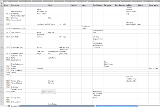
I had developed a spreadsheet of all the data I had been researching about brands as below so as I extended the range to over 40 books this proved a useful way of keeping track of things


Brief 5 Evaluation
Brief 5 has been a great opportunity to work with a real client who I have an enormous amount of respect for. The challenges in the brief have been a limited budget and also both obtaining and agreeing content and images. The design process definitely slows down when you have to get content off your client and also then agree the design and proofs. I was also working for a partnership (Mother and daughter run the school) so it was challenging getting agreement from both and also pleasing both generations.
I have established some great Printer contacts and also managed the process of sending and proofing a file for print.
It has also been useful understanding how to set up a URL, hosting and web building. The sites have templates however you can start with a blank canvas and design your own pages. Its certainly a great way of doing web design when your client has not got much money.
Getting the books back from print was probably the most exciting thing, if a not a bit nerve racking!
Brief 2 Evaluation
The brief was an unsuccessful at D&AD student awards I think perhaps in the main because it may not have been considered to be commercially viable ie the diamantes. I believe the concept is strong especially the Festival Campaign
Brief 4 Evaluation
I literally got the business cards and portfolio folder off Tom the morning of hand in so haven't taken any photographs of the final products but they are in my Module hand in.
Going forward the stock for the folder needs to be heavier than 175gsm as it does tear easily however I am pleased with the concept and the mid green colour blends well with the wooden business cards. The business cards have been reasonably successful and Tom is really pleased with them I still think we could adjust the typeface so it is more readable . Tome has made 40 business cards all together. He estimates it will cost £100 for 50 cards including his time which is comparable with the duplex GF smith cards I got printed.
Tom plans to use all the print collateral and also wants me to make him the large label for the End of Year Show as he is hoping to sell his chairs and table.
Overall all the design is accessible to Tom on a low budget and going forward I am going to show him how to update the Cargo website as he is planning to get more photographs after hand in.
I have thoroughly enjoyed working with Tom despite the problems as I really feel I've been able to help him with his PPD and hopefully help him secure a job
Saturday, 25 May 2013
Tom's online presence
I have registered Tom on the BCFA website below. I am just waiting for him to confirm this so I can upload his CV and Portfolio.:


Brief one Colour scheme
A real link to Heritage is colour. The Mods especially have become associated with red white and blue circles. I dont want the colour scheme to be cliched so I have thought of a different angle which will be more subtle. I am thinking Classic Car colours...they connote heritage even in a different context.


Proposed colour scheme for the Subcultures. The threads of each brand will be white

Subscribe to:
Posts (Atom)